Wednesday, 15 March 2017

Final evaluation of my media coursework for my music video-answers part 2

What have you learned from your audience feedback?

How did you use media technologies in the construction and research, planning and evaluation stages?


Thursday, 2 March 2017

Tuesday, 28 February 2017

Final evaluation of my media coursework for my music video-answers part 1

In what ways does your media product use, develop or challenge forms and conventions of real products?

My media conforms to and uses conventions of real products because in terms of cinematography I have included a mix of live and stage performance to create a deeper impact on the audience, my camera angles and shots conform to that both of other music videos of my genre as well as my music choice, also I have included a multitude of mid and close-up shots of the artist to help emphasise their voice and the skill/talent they have but have included long shots as well to make use of the locations I have used as well as helping the audience to understand my artists biography and in particular his love of nature.
In terms of editing I have challenged the usual conventions for a male music video because due to the song I have selected I have a mix of slow and fast paced editing/cuts rather because of the song type to match the pace, normally a slow paced song and edit would be associated to a female artist.
My music video further conforms to the genre that I have selected (Pop) because I have put more focus into the craftsmanship of the video rather than a major emphasis on the formal ‘artistic’ qualities of the artist, furthermore because of the type of song I have chosen I further conform to the Pop genre because my main target audience is the youth market but particularly the older youth audience (early adulthood).

How effective is your combination of your main product and ancillary texts?

The combination of my main product and my ancillary texts are very effective because both bounce off of each other through the similar themes and representation of my artist that they both have, in particular they reflect my artists love of nature and the outdoors through the use of the visual aspects in both as well as the colour co-ordination in my Digipak and Magazine Advert, furthermore in both the camera angles and shots are similar and thus further reflect the idea/background on my artist and his love of the outdoors.
The combination is also effective because the settings in both my digipak and magazine advert as well as my music video are visually similar and thus makes the combination more relatable to the view from the audience and overall makes the whole package effective.
Final evaluation of my media coursework for my music video-evaluations

1) In what ways doe your media product use, develop or challenge forms and conventions of real media products?


2) How effective is the combination of your main product and ancillary texts?


3) What have you learned from your audience feedback?


4) How did you use media technologies in the construction and research, planning and evaluation stages?

Tuesday, 21 February 2017

Final evaluation of my music video for my media coursework-questions

Key questions to answer for my final evaluation:


  • In what ways does your media product use, develop or challenge forms and conventions of real products?
  • How effective is your combination of your main product and ancillary texts?
  • What have you learned from your audience feedback?
  • How did you use media technologies in the construction and research, planning and evaluation stages?

Filming and editing update 21/02/2017

Date: 21/02/2017

Description:
Today I analysed and evaluated the feedback I had received on my most recent showing of my music video and worked out what shots I need to re-do and when, the main shots that I felt I could update/ change today were the shots of the text messages on my phone, in my initial video the background was black and broke from the video's continuity and didn't help it to flow as well, therefore today I re-did these particular shots at the location that they would reflect and most effectively work with.

Furthermore in regards to my editing I removed some of the shots from the beginning and the end that I was told did not help conform with the video I made or to the genre that I was trying to convey.

Analysis of my 2nd feedback sheets for my Music Video

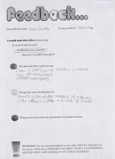
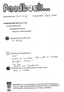
These are the responses from my class mates in regards to my music video upon the second and final viewing of it before it is marked,the responses came in three from: The elements that worked, the elements that need improving and the elements that don't work.

Elements that work well:

  • Cinematography
  • Lip synching
  • Clear narrative
  • Messages fit with the story
  • Flashback effects
  • Good editing
  • Good adaptations from previous feedback
  • Locations were good
Elements that need improving:
  • Shaky camera
  • Repetitive locations
  • Some shots are too long
  • Narrative unclear in some parts
  • Needs a change in performance
  • Not consistent weather
  • Use some slow motion
Elements that don't work:
  • Poem at beginning
  • Phone sections are too dark/ don't work with the story
  • Background doesn't fit
  • Need to change up locations
  • Cheeky wink at the end
  • Head gets cut off in some areas

Tuesday, 7 February 2017

Filming and Editing Update 07/02/2017

Date: 07/02/2017

Description:
Today I have completed the final parts that I feel I needed to add onto my music video, from the last time I blogged I have added on several transitions and have adjusted the sequencing so that the locations are less consistent and therefore making the video more interesting, also I have added a small voice audio clip into the beginning, I have done this as a from of intertextuality in reference to the Pop video by Justin Bieber entitled 'Love Yourself', I have done this to make the video more appealing because fans of Bieber will recognise the style used.


Tuesday, 31 January 2017

Filming and Editing Update 31/01/2017

Date: 31/01/2017

Description:
Today I have re-edited my music video much more extensively and with updates to the clips and the variety of locations I used (a key edit my feedback sheets expressed).
Unfortunately due to recent technical difficulties regarding my music video and FinePix Pro I was forced in essence to completely re-edit the entire music video and take the original clips and put them back into my video, while this was a time consuming process it was still completed.

Today as I said I have in-put the new clips that were requested from my feedback sheets, these clips are also important because they help to reveal the narrative of my video much more and further allow the video to be less consistent and predictable.

Friday, 27 January 2017

Filming Blog Post for 4th red-shoot

Date: 27/01/2017

Description:
On Tuesday the 24th of January 2017 I did some more re-shooting for my Music Video, unfortunately my intention to do the majority of filming outside of school on that day was set back slightly by the lack of willing cameramen/women.

However I was able to do some of the key scene shooting inside of school and I was able to secure some very usable film. Moreover despite the set back I was still able to film outside of school because I needed to gain some more landscape panning shots as suggested by my teacher and fellow class mates.

Friday, 16 December 2016

3rd Re-Edit of my Digipak and Mag Advert


These are the re-edits for my Digipak and Magazine Advert, my digipak remains relatively the same except for a few adjust,tents to the fonts and spines.

My Magazine Advert is completely different though, because I didn't have a non blurry version of the picture I had used I decided to use a style that a majority of my fellow classmates had done by which the main image was the CD Cover with key info and social media sites spread around it.

This is much more effective in my opinion and personal i believe it gives me much more room to edit and adjust it to my preferred style.

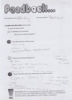
General Analysis of my feedback sheets for my Digipak and Magazine Advert

Elements that worked well:

  • Clear and consistent colour scheme,
  • Very conventional to my artist,
  • Appropriate fonts used,
  • the Track listing is effective,
  • A consistent theme throughout,
  • The pictures used are appropriate,
  • The layout is conventional and effective,
  • The colour scheme works well,


Elements that need adjusting:

  • Blurry picture on the Mag Advert needs to be replaced/ re-shot,
  • The logo looks out of place on the digipak,
  • Too many fonts are used,
  • Magazine looks more like a cover rather than an advert,
  • The spine is too plain,
  • The album cover blends in too much,
  • The social media links need to be more readable,
  • Don't underline anything,
  • Use the same fonts on both Mag Advert and Digipak,
  • Adjust the font colour on the Track Listing,
  • Make the barcode smaller,
  • Make the typography clearer to read,


Elements that don't work:

  • Don't use Comic-Sans,
  • Remove the white background behind the text on Mag Advert,
  • Album cover is too small in the background,

General Analysis of my feedback sheets for my Music Video

Elements that worked well:

  • The lip-synching is very effective and precise,
  • The cinematography works well,
  • The type of location does work,
  • Costume conforms to the artist,
  • End shot works well with the song,


Elements that need to be developed:

  • It is too repetitive-need to change up my locations for my shoot,
  • Adjust the clips to reveal the narrative more,
  • Need to incorporate different shots-the shot yes are too repetitive,
  • Remove the clapping at the end of the song,
  • use more panning shots in the video,
  • The video needs to be re-shot on a single day,
Elements that don't work:
  • The transition at the very beginning doesn't work
  • Re-shoot some of the clips-moving vehicles in the background

2nd feedback of my Digipak and Magazine Advert


2nd feedback for my Music Video


Friday, 9 December 2016

3rd shoot of my Music Video vlog

Date: 09/12/2016

People Involved: Robert, Harry

Description:
Today myself and my friend Harry went out to Danson Park and did the final shooting for my Music Vide, unfortunately the weather today was not the best and was significantly different compared to previous shoots, therefore due to a time constraint leading up to Christmas I should be able to do any re-shoots after Christmas in the lead up to February when my final product must be given in.