Friday 16 December 2016

3rd Re-Edit of my Digipak and Mag Advert


These are the re-edits for my Digipak and Magazine Advert, my digipak remains relatively the same except for a few adjust,tents to the fonts and spines.

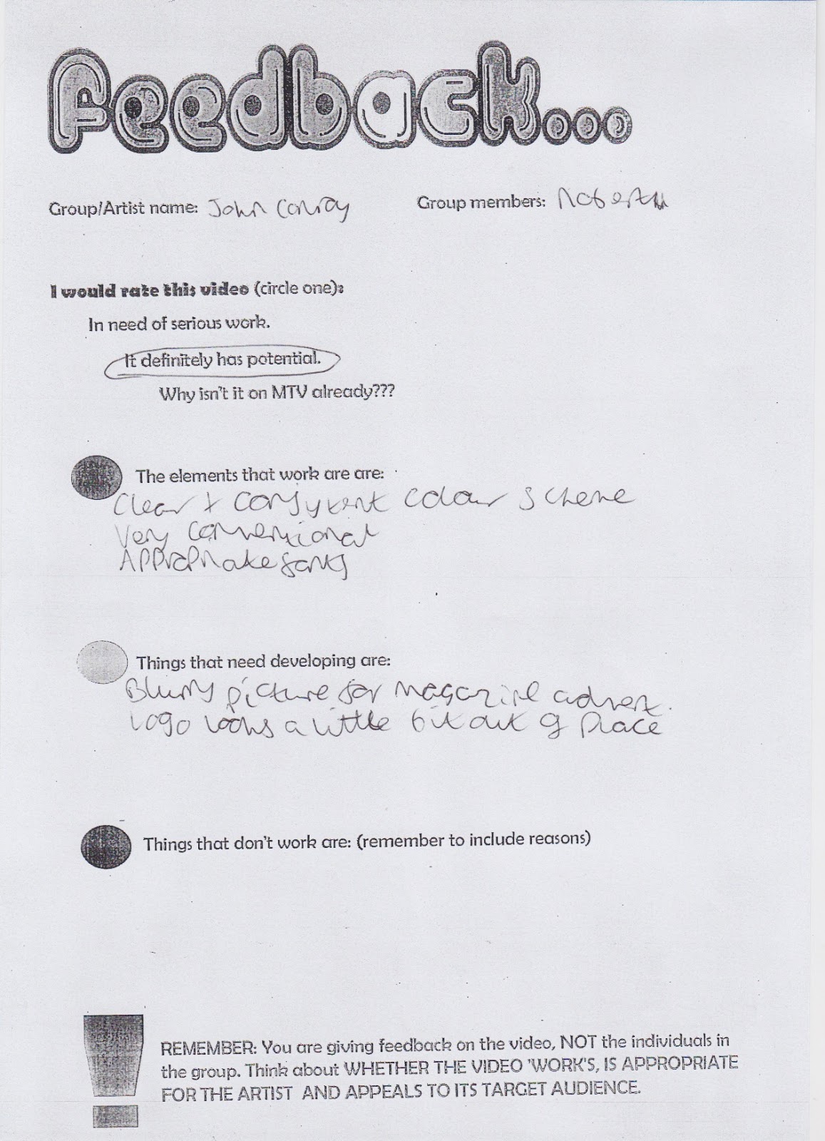
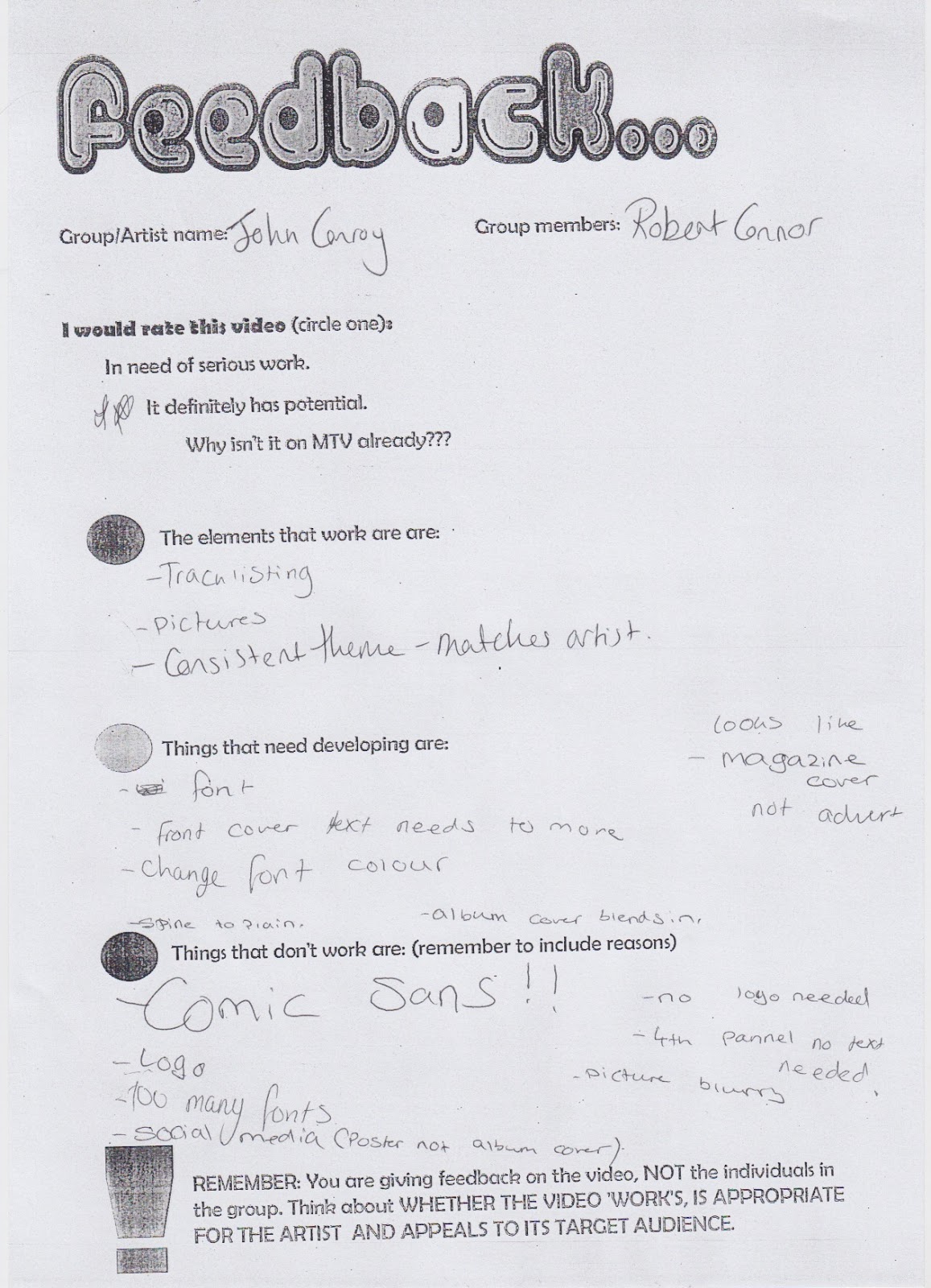
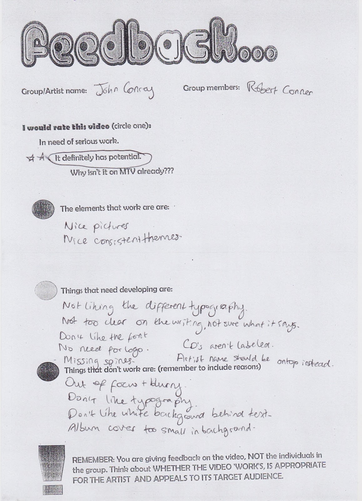
My Magazine Advert is completely different though, because I didn't have a non blurry version of the picture I had used I decided to use a style that a majority of my fellow classmates had done by which the main image was the CD Cover with key info and social media sites spread around it.

This is much more effective in my opinion and personal i believe it gives me much more room to edit and adjust it to my preferred style.

General Analysis of my feedback sheets for my Digipak and Magazine Advert

Elements that worked well:

  • Clear and consistent colour scheme,
  • Very conventional to my artist,
  • Appropriate fonts used,
  • the Track listing is effective,
  • A consistent theme throughout,
  • The pictures used are appropriate,
  • The layout is conventional and effective,
  • The colour scheme works well,


Elements that need adjusting:

  • Blurry picture on the Mag Advert needs to be replaced/ re-shot,
  • The logo looks out of place on the digipak,
  • Too many fonts are used,
  • Magazine looks more like a cover rather than an advert,
  • The spine is too plain,
  • The album cover blends in too much,
  • The social media links need to be more readable,
  • Don't underline anything,
  • Use the same fonts on both Mag Advert and Digipak,
  • Adjust the font colour on the Track Listing,
  • Make the barcode smaller,
  • Make the typography clearer to read,


Elements that don't work:

  • Don't use Comic-Sans,
  • Remove the white background behind the text on Mag Advert,
  • Album cover is too small in the background,

General Analysis of my feedback sheets for my Music Video

Elements that worked well:

  • The lip-synching is very effective and precise,
  • The cinematography works well,
  • The type of location does work,
  • Costume conforms to the artist,
  • End shot works well with the song,


Elements that need to be developed:

  • It is too repetitive-need to change up my locations for my shoot,
  • Adjust the clips to reveal the narrative more,
  • Need to incorporate different shots-the shot yes are too repetitive,
  • Remove the clapping at the end of the song,
  • use more panning shots in the video,
  • The video needs to be re-shot on a single day,
Elements that don't work:
  • The transition at the very beginning doesn't work
  • Re-shoot some of the clips-moving vehicles in the background

2nd feedback of my Digipak and Magazine Advert


2nd feedback for my Music Video


Friday 9 December 2016

3rd shoot of my Music Video vlog

Date: 09/12/2016

People Involved: Robert, Harry

Description:
Today myself and my friend Harry went out to Danson Park and did the final shooting for my Music Vide, unfortunately the weather today was not the best and was significantly different compared to previous shoots, therefore due to a time constraint leading up to Christmas I should be able to do any re-shoots after Christmas in the lead up to February when my final product must be given in.


Thursday 8 December 2016

2nd Re-edit of my Digipak


Questionnaires on the Pop genre as Research for my Music Video


Pop Genre Questionnaires:

These are the scans of the Questionnaires that I gave to my class mates to act as research for my understanding of the Pop genre and to help me understand more about my music videos needs/ conventions.


Friday 2 December 2016

1st Draft Version of my Music Video-Analysis

In this analysis of my 1st draft I will be looking at how my video conforms to the codes and conventions of the Pop video and also how my Artists background/ personality is shown through the music video.

Through my song selection my music video conforms to the Pop genre because:

  • It conforms to the idea that it looks to a youth market as its target audience (see Audience profile for specifics),
  • While it is mainly a slow song the mix of fast editing and long shots are related to music videos released by male artist,
  • The camera shots and angles are at a good distance where they are close enough to see the artist singing while far enough to allow the audience to see the guitar being played
Through the conformities of my artist my music video:

  • Relates to my artist through his love nature and the outdoors,
  • His clothing is very open and bright but still comfortable thus showing his simple but open personality to his audience,
  • The use of the guitar to express his profession of being an experienced guitar player helps the audience understands his skills and are thus able to relate thorium more, particularly those audiences interested in music and performance,


Thursday 1 December 2016

1st Draft Version of my Music Video

Red-edited Versions of my Digipak and Magazine


These are the redrafted versions of my original Digipak and Magazine advert, using the feedback I gained last time form my class mates the main edits i did were to my Magazine advert because I had in fact originally made it into a Magazine Cover, although I did also adjust the position of the Digipak photos to make them more coherent to the design of a conventional Digipak.